Logo for Women's Resource Clinic with a stylized flower icon, white text on a dark gray background.
Logo for Women’s Resource Clinic featuring a dark grey spiral floral icon replacing the letter O, on a light pink background.
A dark charcoal logo of four swirling, interlocking curved shapes centered on a light blue background.
A sage green square featuring the white, bold text
Five oval icons in a row with the labels: Community, Wellness, Empower, Education, and Fairness.
A comparison of two sans-serif fonts on a light pink background, labeling
A woman sits on a sofa, looking at a laptop. Overlaid is the text
A healthcare provider in blue scrubs points at a tablet screen while consulting with a patient in a medical office.
A person wearing a black shirt reaching into a beige tote bag featuring a navy blue spiral logo.
Hands typing on a laptop displaying a website with text and a landscape photo on a wooden desk.

client

Women's Resource Clinic

project

Logo & Brand Identity

context

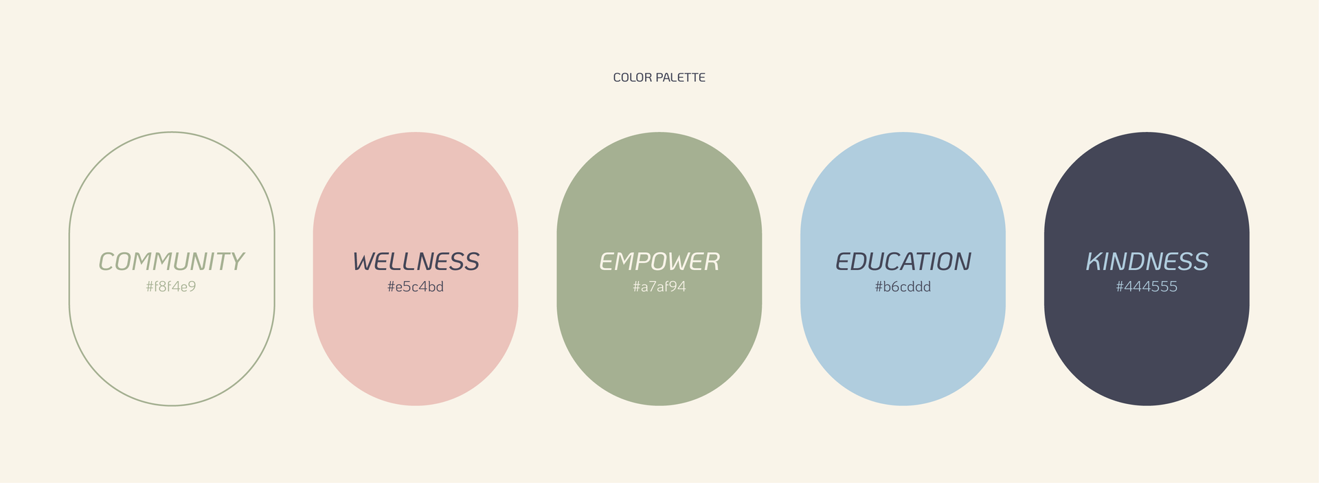
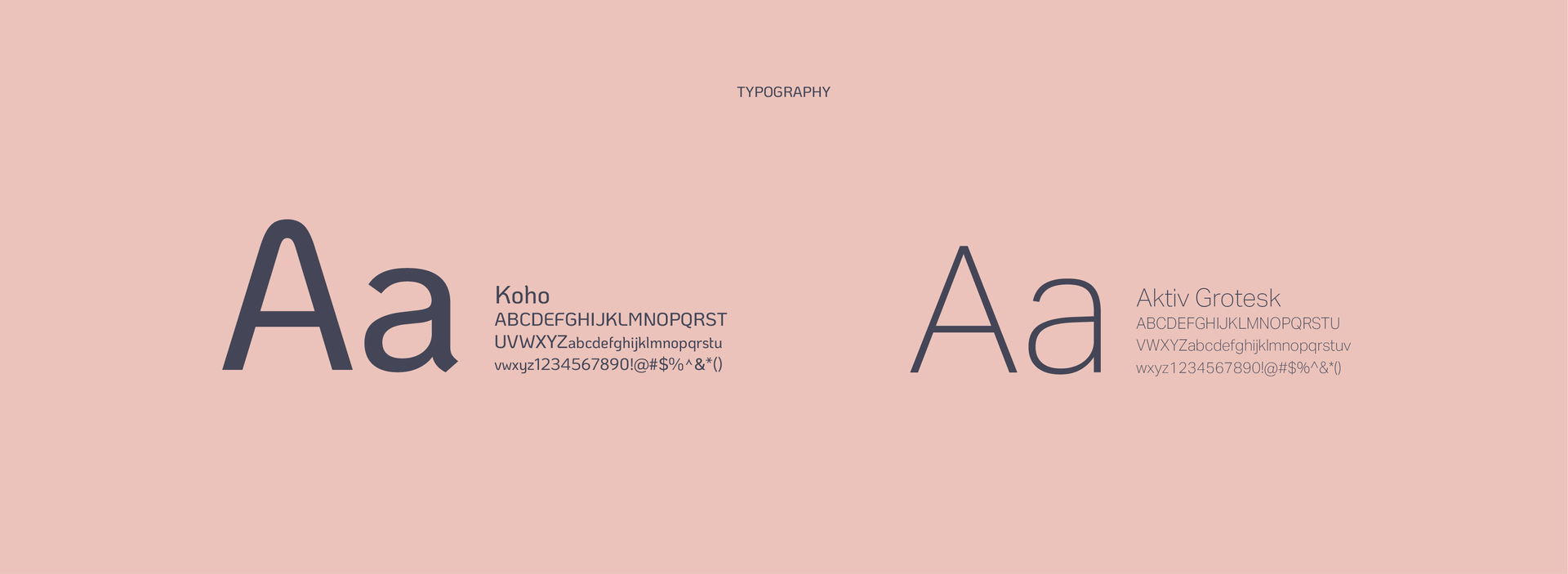
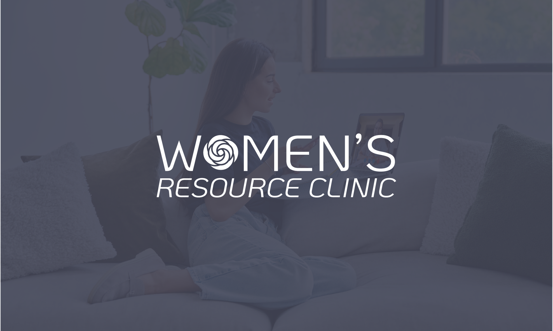
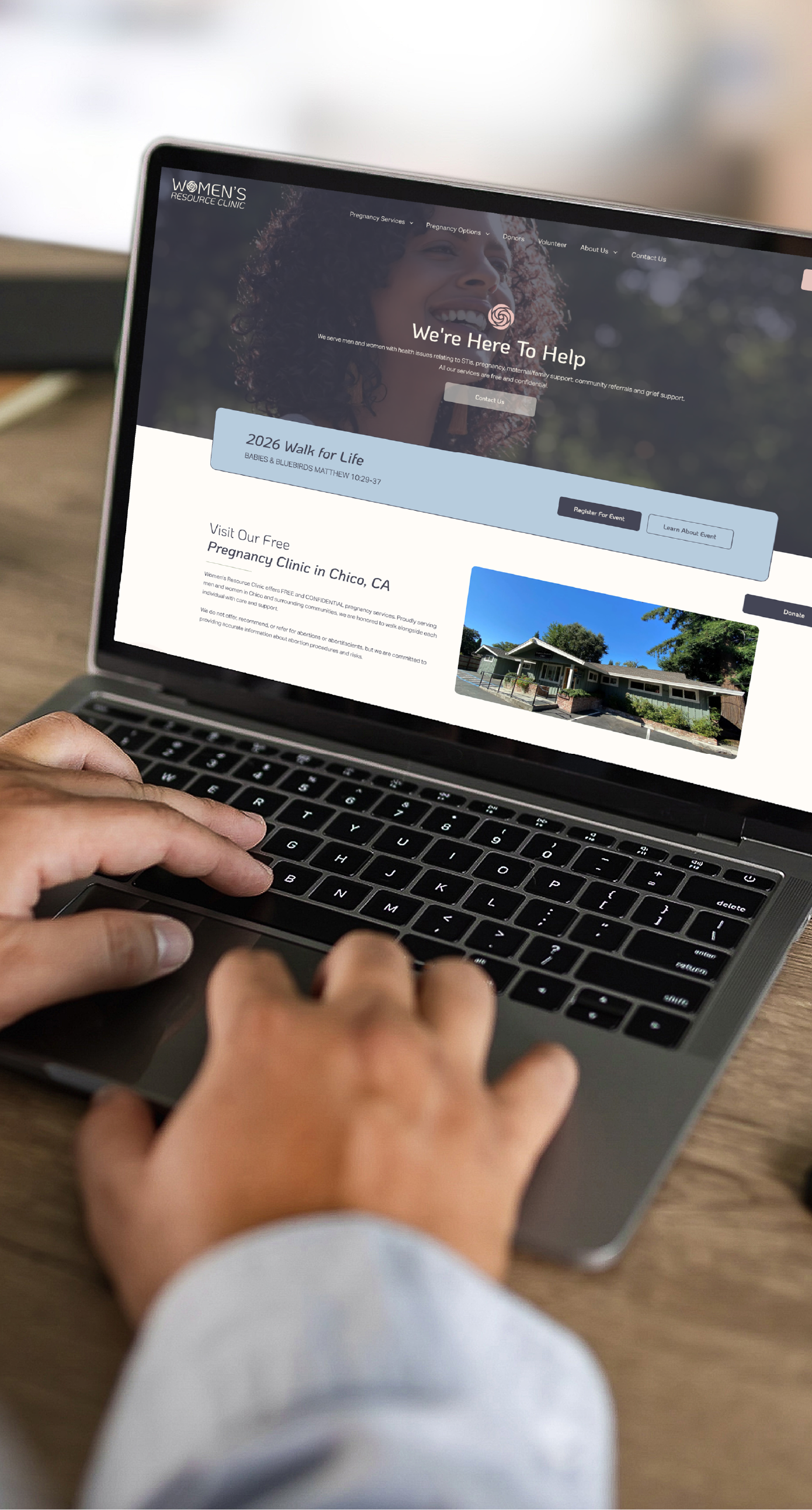
Women’s Resource Clinic needed a brand that felt supportive, trustworthy, and rooted in its community. The goal was to create something approachable for individuals navigating unplanned pregnancies while still feeling clear and informative. I developed a logo and identity built around a rose-inspired mark that also references the local identity of Chico, creating a sense of place within the system. Soft, balanced colors and clean typography help keep the experience calm and easy to engage with. The identity supports a range of services from testing to counseling without feeling overwhelming. The result is a brand that feels steady, compassionate, and centered on care.