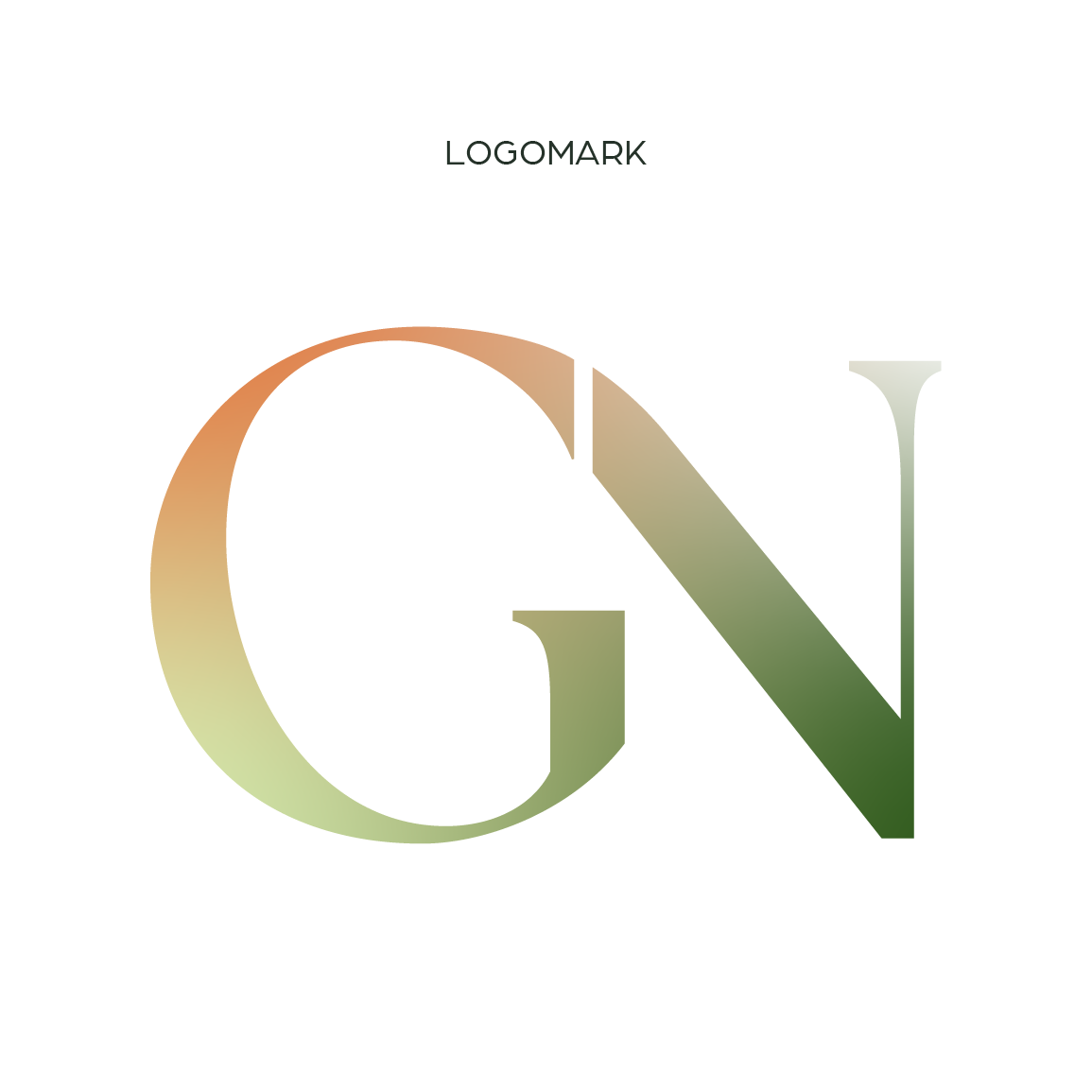
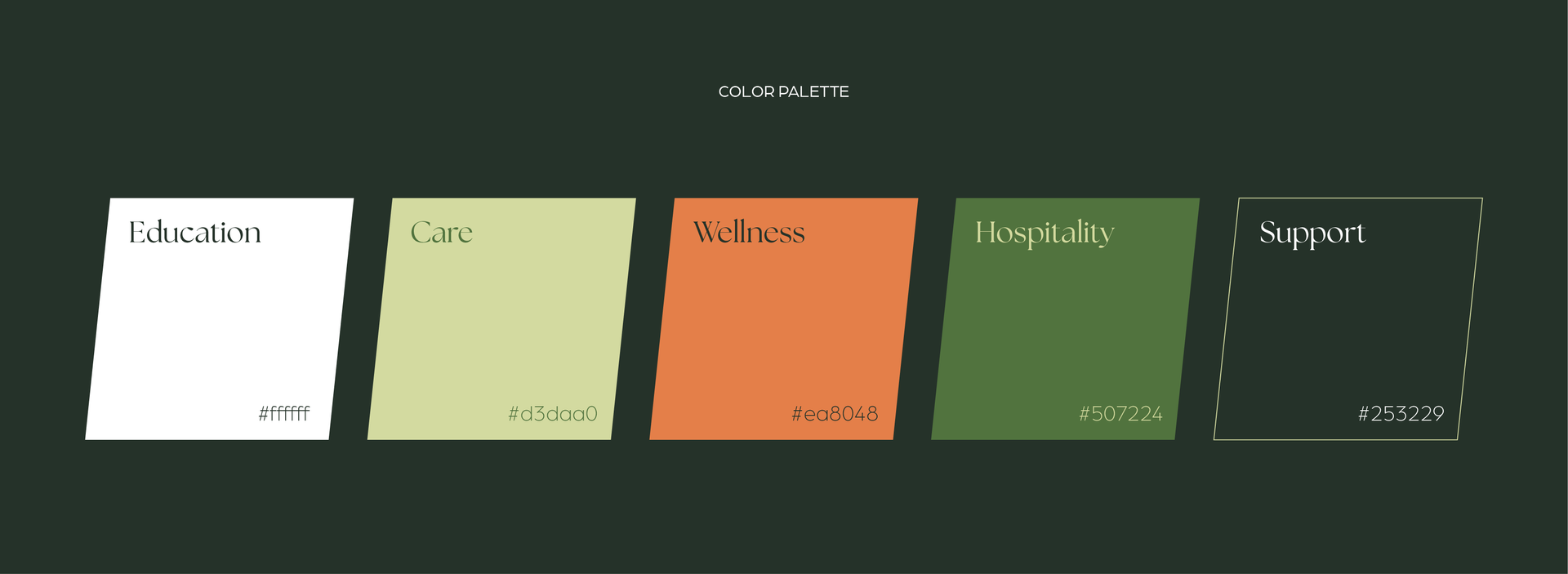
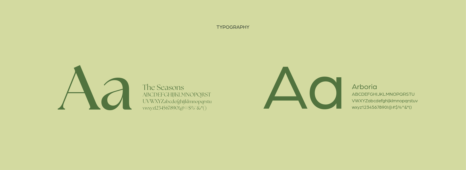
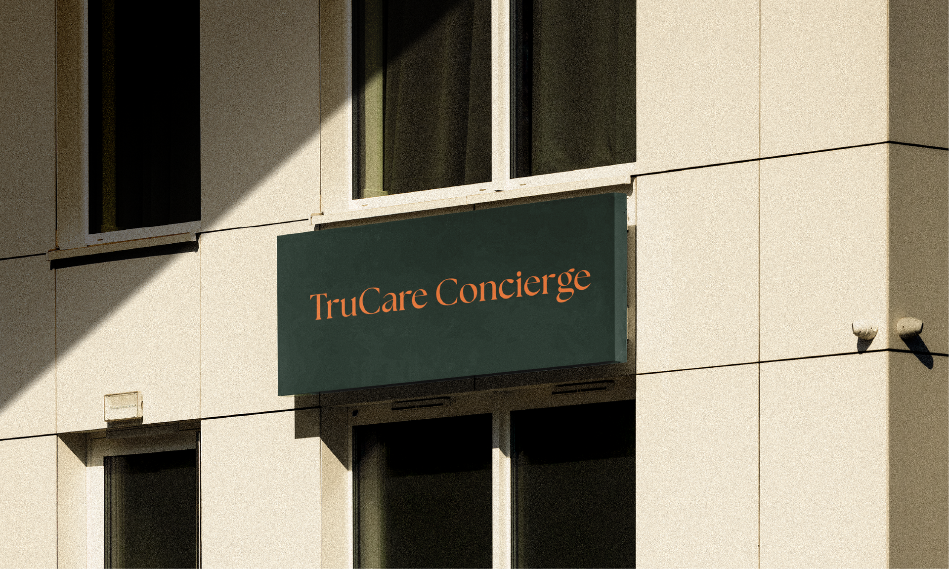
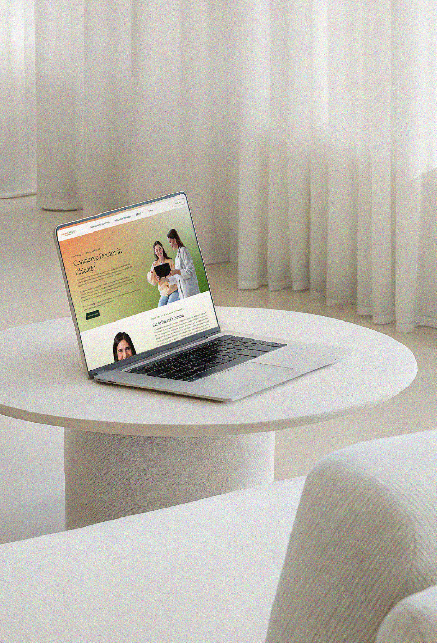
TruCare Concierge needed a brand that felt both personal and precise. The goal was to reflect a more accessible, preventative approach to care while maintaining a sense of expertise. I developed a logo and identity built around soft gradients and subtle slanted forms that introduce movement and a sharper edge to the system. The visual language carries through typography and layout to keep the experience calm, clear, and easy to navigate. It positions the practice as a more thoughtful, relationship-driven alternative to traditional primary care. The result is a brand that feels warm, modern, and confidently structured.