Tranquil Healthcare logo in white text on a dark green background with a faint, decorative tree illustration.
A dark green wordmark logo on a beige background reading
A dark green logo featuring a stylized, intertwining tree inside an arched frame, set against a light beige background.
Logo for
A color palette featuring four arched swatches: Evergreen, Seashell, 24 Karat, and Salmon on a dark green background.
A comparison of two fonts labeled
Hands typing on a laptop displaying a website titled
A modern, brightly lit waiting room featuring a pink sofa, glass coffee table, and a reception desk with a moss wall.
A person in a meditative pose with hands raised, overlaid with the text
A professional in a lab coat sets up an IV drip for a patient wearing a white robe.

client

Tranquil Healthcare

project

Brand Identity

context

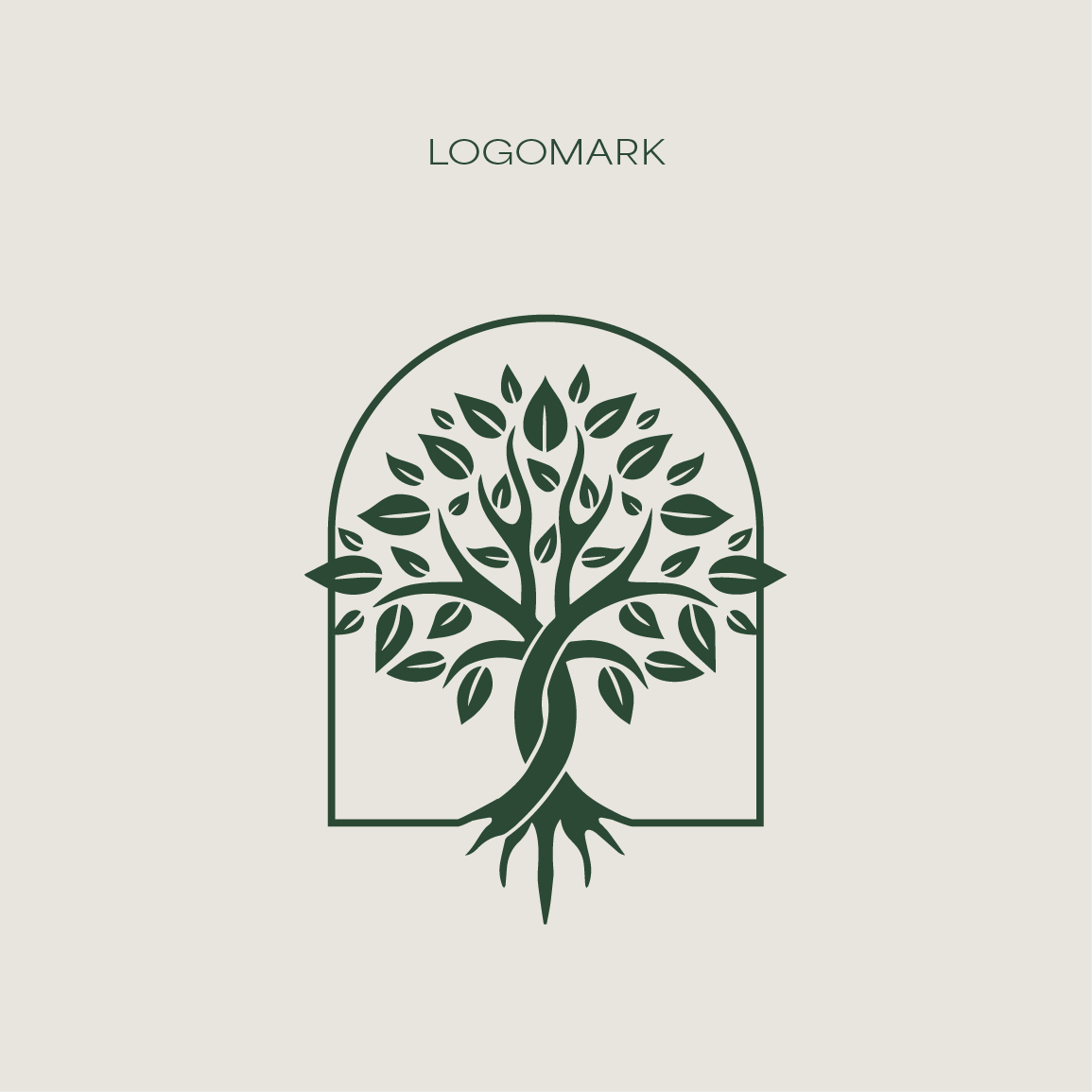
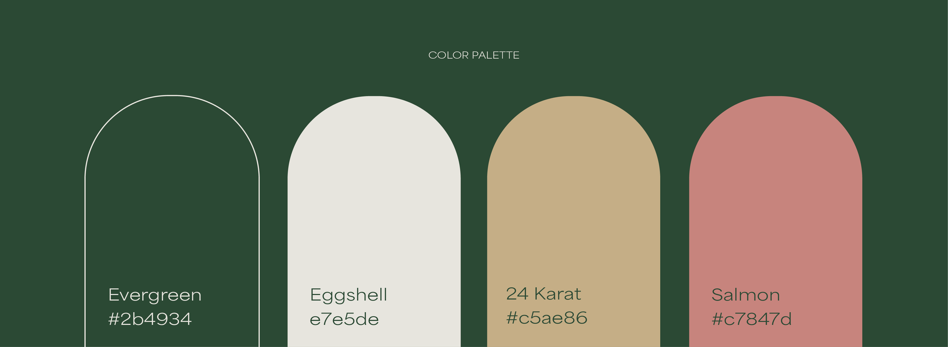
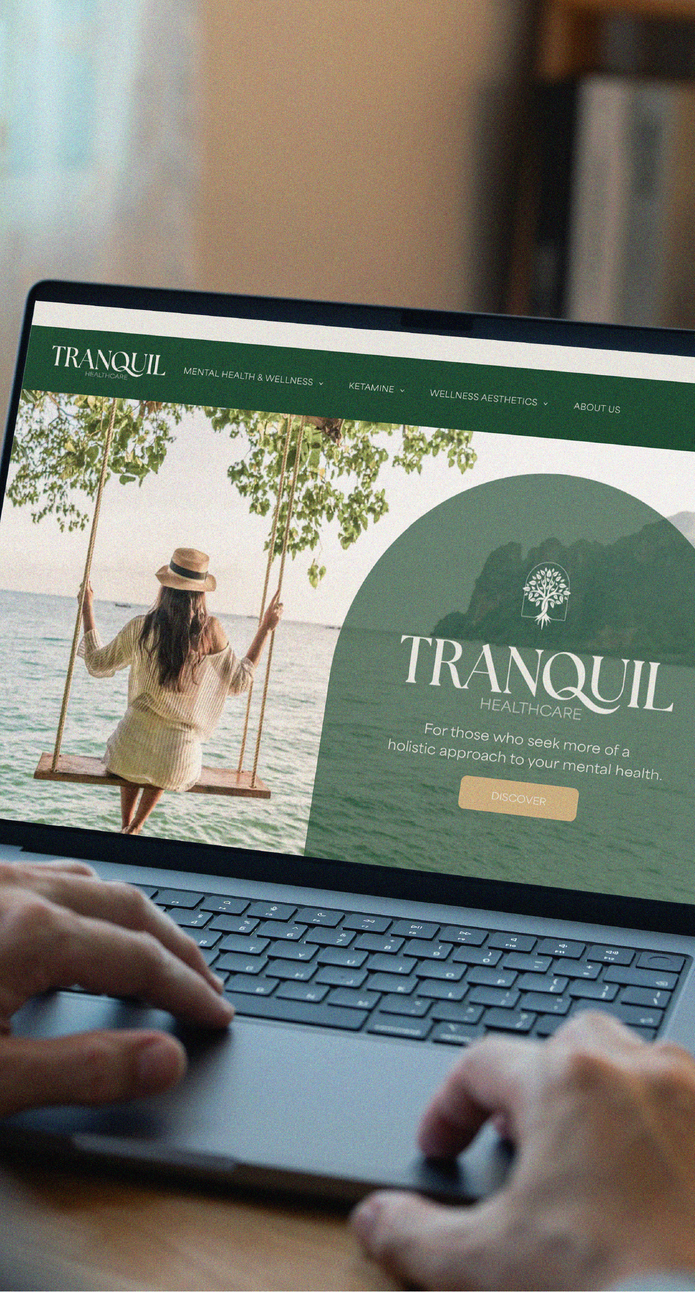
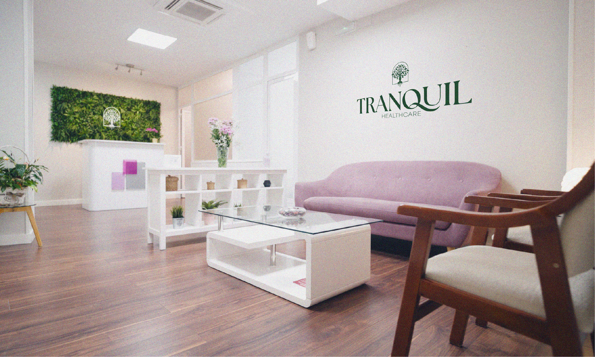
Tranquil Healthcare needed a brand that felt calm, grounded, and centered on patient experience. The goal was to create something more personal and holistic while maintaining a sense of trust and clarity. I developed an identity built around soft arches that repeat throughout the system, shaping layouts and creating a sense of structure without feeling rigid. The color palette and typography work together to keep the experience warm, quiet, and easy to move through. It supports a more individualized approach to care for patients seeking balance, clarity, and long-term wellness. The result is a brand that feels composed, restorative, and intentionally designed around its audience.