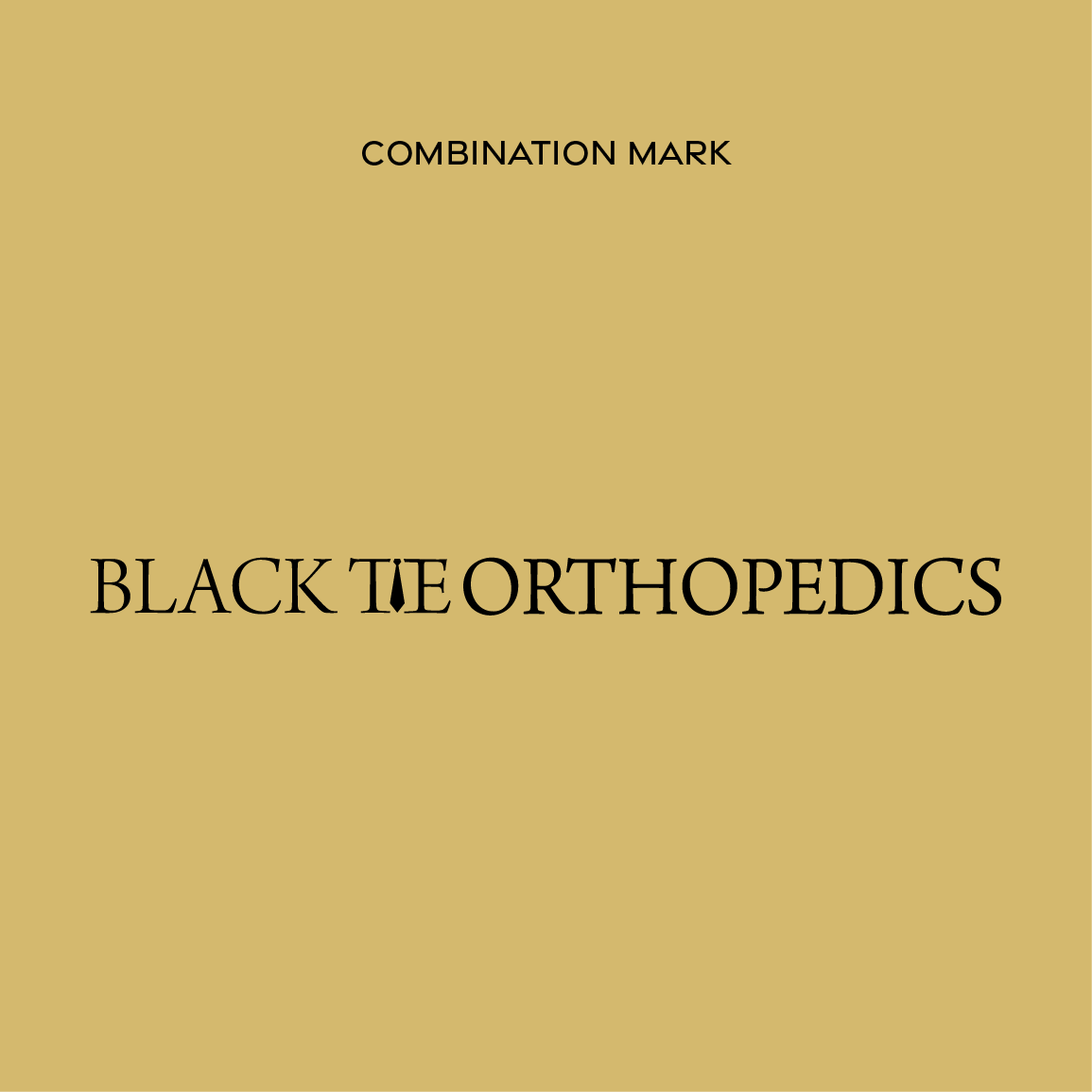
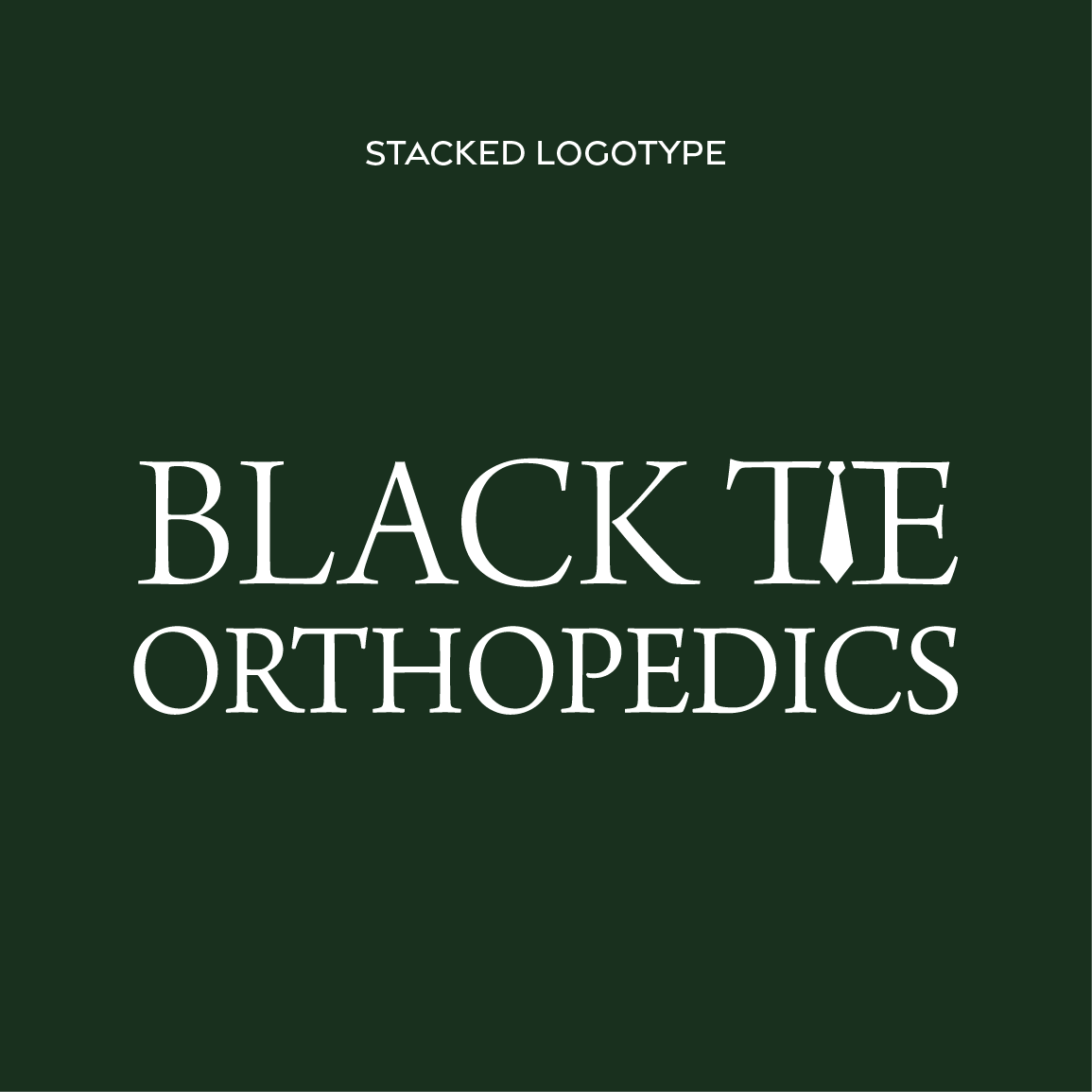
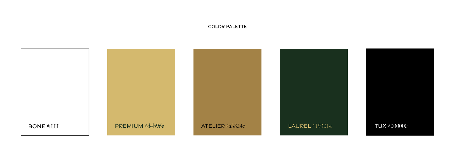
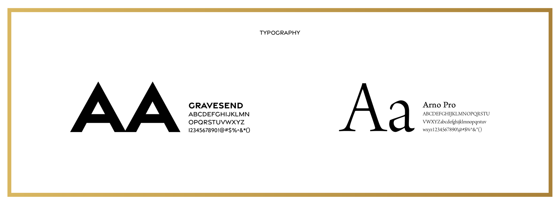
Black Tie Orthopedics needed a brand that matched the level of care they provide. The goal was to position the practice as a more refined, concierge-style experience for active patients. I developed a logo and identity built around a tie-inspired mark that expands into structured frames used throughout the system. Gold is used to outline and contain elements, adding a sense of precision and control. "where care is a formal occasion"anchors the brand and reinforces its tailored, elevated approach. The result is a brand that feels composed, distinctive, and built around a more personalized standard of care.